- Home
- :
- Product Forums
- :
- General
- :
- Re: The new UI is very difficult to view.
This content from the SAP Concur Community was machine translated for your convenience. SAP does not provide any guarantee regarding the correctness or completeness of this machine translated text. View original text custom.banner_survey_translated_text
- Mute
- Subscribe
- Bookmark
- Report Inappropriate Content
The new UI is very difficult to view.
The new UI is very difficult to view in many forms (Expense and Invoice).
Expenses ICONS: The icons are too busy now. They have too much white, which makes it harder to discern the different colors for different credit card programs. These should be more solid colors, making them easier to identify.
DOTTED LINES: what is the purpose of the dotted lines in the fields?
FONT: too light and almost illegible in many fields.
My company would be happy to beta test updates prior to mass roll-outs that affect us adversely. Hopefully these items will be reviewed and fixed for better functionality. Thanks.
This content from the SAP Concur Community was machine translated for your convenience. SAP does not provide any guarantee regarding the correctness or completeness of this machine translated text. View original text custom.banner_survey_translated_text
- Mute
- Subscribe
- Bookmark
- Report Inappropriate Content
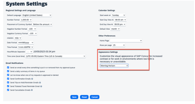
@dbetti Hi! I see that you have posted in the Admin group too. I know this has been a common theme from users, you can change the settings in the System Settings and that might help.
Let us know if you have more questions!
Remember to tag me if you respond or feel free to mark this post as Solved if you don't have further questions or comments. To tag me on your response, you click the Reply button, first thing to type is @. This should bring up the username of the person you are replying to.
Thank you,
Melanie Taufen
SAP Concur Community Moderator
Did this response answer your question? Be sure to select “Accept as Solution” so your fellow community members can be helped by it as well.
This content from the SAP Concur Community was machine translated for your convenience. SAP does not provide any guarantee regarding the correctness or completeness of this machine translated text. View original text custom.banner_survey_translated_text
- Mute
- Subscribe
- Bookmark
- Report Inappropriate Content
All four settings are difficult to read. Not just for me, but for many of my co-workers.
This content from the SAP Concur Community was machine translated for your convenience. SAP does not provide any guarantee regarding the correctness or completeness of this machine translated text. View original text custom.banner_survey_translated_text
- Mute
- Subscribe
- Bookmark
- Report Inappropriate Content

