Who Me Too'd this topic
- Home
- :
- Product Forums
- :
- Concur Expense Forum
- :
- Who Me Too'd this topic
Who Me Too'd this topic
This content from the SAP Concur Community was machine translated for your convenience. SAP does not provide any guarantee regarding the correctness or completeness of this machine translated text. View original text custom.banner_survey_translated_text
- Mute
- Subscribe
- Bookmark
- Report Inappropriate Content
New User Interface
Hi
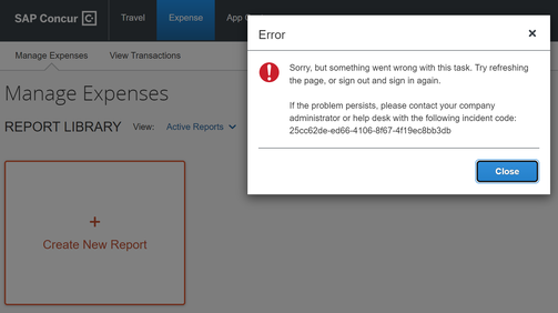
Has anyone found that since switching to the New UI that the site seems to be riddled with error message when users are navigating through various menus. I am receiving daily emails like the one below when our users are trying to do basic tasks.
In addition to this I agree with the other admins that the new UI is not an improvement at all. It is surprising that the tool seems to have gone backwards rather than forwards. Concur was looking dated and now the overall functionality is poor.
It seems much slower as well which is not good for busy users that want to get their expenses done as quickly as possible.
Today receipts are not working. What next?

