- Home
- :
- Product Forums
- :
- Concur Expense Forum
- :
- Re: Personal Mileage
This content from the SAP Concur Community was machine translated for your convenience. SAP does not provide any guarantee regarding the correctness or completeness of this machine translated text. View original text custom.banner_survey_translated_text
- Mute
- Subscribe
- Bookmark
- Report Inappropriate Content
Personal Mileage
Hi,
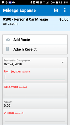
I just noticed that the App has highlighted fields to show what is required and our users used the red highlighted fields instead of using the "Add Route" icon, which appears to be "greyed out". Do others find this a problem for their users?
If a user fills in the fields, there is no support for their trip.
American Society of Hematology
This content from the SAP Concur Community was machine translated for your convenience. SAP does not provide any guarantee regarding the correctness or completeness of this machine translated text. View original text custom.banner_survey_translated_text
- Mute
- Subscribe
- Bookmark
- Report Inappropriate Content
Darryl,
The icon is gray in color, but when I press it on my phone, it allows me to add a route. Have you tried using the Add Route option and it didn't work or did you think it wasn't available because of the gray color?
Thank you,
Kevin
SAP Concur Community Manager
Did this response answer your question? Be sure to select “Accept as Solution” so your fellow community members can be helped by it as well.
This content from the SAP Concur Community was machine translated for your convenience. SAP does not provide any guarantee regarding the correctness or completeness of this machine translated text. View original text custom.banner_survey_translated_text
- Mute
- Subscribe
- Bookmark
- Report Inappropriate Content
Kevin,
A user looks at this screen and sees two greyed out icons and items in red that need to be taken care of... what is he/she going to do? Immediately gravitate to those items in red.
Did you notice I greyed out the word "icons" above? I think most users would miss the icons. Can this be changed to make the icons not grey so it looks like you should be using them?
Thanks!!
American Society of Hematology
This content from the SAP Concur Community was machine translated for your convenience. SAP does not provide any guarantee regarding the correctness or completeness of this machine translated text. View original text custom.banner_survey_translated_text
- Mute
- Subscribe
- Bookmark
- Report Inappropriate Content
I agree. The design of the screen does not encourage them to add route. Wording also not ideal.
I don't understand why the receipt option appears on this expense type either,
T-Mobile
Senior Analyst Travel, Card & Expense
US
https://www.linkedin.com/in/sandra-ahola-4704553/

