- Home
- :
- Product Forums
- :
- Concur Expense
- :
- Re: Credit card icons no longer showing in new UI
This content from the SAP Concur Community was machine translated for your convenience. SAP does not provide any guarantee regarding the correctness or completeness of this machine translated text. View original text custom.banner_survey_translated_text
- Mute
- Subscribe
- Bookmark
- Report Inappropriate Content
Credit card icons no longer showing in new UI
In the old user interface, it was very clear which expense entries had been sourced or matched to a credit card transaction (small blue credit card icon next to each entry). Under the new UI, I can't tell which entries have been matched to a credit card transaction or not. This seems like a very obvious feature that went away, so I suspect I don't have a configuration set up correctly, or am not looking in the right places. Anyone having similar issues/concerns, or know of a solution?
- Labels:
-
NextGen UI
This content from the SAP Concur Community was machine translated for your convenience. SAP does not provide any guarantee regarding the correctness or completeness of this machine translated text. View original text custom.banner_survey_translated_text
- Mute
- Subscribe
- Bookmark
- Report Inappropriate Content
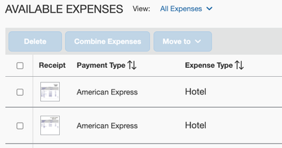
@chrislin the icons were done away with. Now you will see the actual name of the payment type listed for the entries both on and off reports. See my screenshot. If the item is from a travel booking and it hasn't matched to a company card transaction yet, it should show with a Pending Card Transaction payment type. Itinerary items that are matched to company card transactions will show the word Reservation under the Expense Type (second screenshot).
Thank you,
Kevin
SAP Concur Community Manager
Did this response answer your question? Be sure to select “Accept as Solution” so your fellow community members can be helped by it as well.
This content from the SAP Concur Community was machine translated for your convenience. SAP does not provide any guarantee regarding the correctness or completeness of this machine translated text. View original text custom.banner_survey_translated_text
- Mute
- Subscribe
- Bookmark
- Report Inappropriate Content
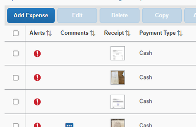
Thank you Kevin. We do not use corporate cards, but we do use personal cards. The payment method shows up as Cash (see screenshot below). Is there any way to cleanly know which items have been matched to a personal credit card transaction?
This content from the SAP Concur Community was machine translated for your convenience. SAP does not provide any guarantee regarding the correctness or completeness of this machine translated text. View original text custom.banner_survey_translated_text
- Mute
- Subscribe
- Bookmark
- Report Inappropriate Content
@KevinD any update here? This has definitely completely up-ended how I am doing expense reports with my personal credit card (matching receipts to credit card entries). I can no longer identify which of my expense entries have been linked to a credit card. This is true both in the report view and in the individual entry view. This feels like a pretty glaring oversight in the redesign, so I feel like I must be missing something.


