- Home
- :
- Product Forums
- :
- Concur Travel Forum
- :
- UI Updates for Concur Travel
This content from the SAP Concur Community was machine translated for your convenience. SAP does not provide any guarantee regarding the correctness or completeness of this machine translated text. View original text custom.banner_survey_translated_text
- Mute
- Subscribe
- Bookmark
- Report Inappropriate Content
UI Updates for Concur Travel
I book travel for a large number of employees using Concur every day and the latest UI updates (Oct 2023) make the system nearly impossible to use. Does anyone have any accessibility tips that will actually make flight costs visible? It is so hard to read this new text.
- Labels:
-
Help
This content from the SAP Concur Community was machine translated for your convenience. SAP does not provide any guarantee regarding the correctness or completeness of this machine translated text. View original text custom.banner_survey_translated_text
- Mute
- Subscribe
- Bookmark
- Report Inappropriate Content
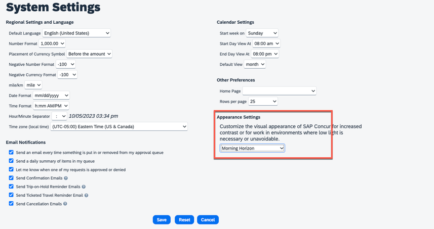
@ashleyscott you can try changing to the Evening version of the new theme. Go to Profile>Profile Settings>Other Settings>System Settings. The Appearance Settings is where you can change. If the color scheme doesn't change after you save, try signing out and signing back in. I believe also our dev team is aware of this and working on a fix.
Thank you,
Kevin
SAP Concur Community Manager
Did this response answer your question? Be sure to select “Accept as Solution” so your fellow community members can be helped by it as well.
This content from the SAP Concur Community was machine translated for your convenience. SAP does not provide any guarantee regarding the correctness or completeness of this machine translated text. View original text custom.banner_survey_translated_text
- Mute
- Subscribe
- Bookmark
- Report Inappropriate Content
.
This content from the SAP Concur Community was machine translated for your convenience. SAP does not provide any guarantee regarding the correctness or completeness of this machine translated text. View original text custom.banner_survey_translated_text
- Mute
- Subscribe
- Bookmark
- Report Inappropriate Content
Just as a follow up in case anyone else is having this problem, I tried this suggestion, and have now tested booking a trip using all 4 of the available appearance settings.
Image of difficult to read flight pricing text in Morning Horizon is above in the OP.
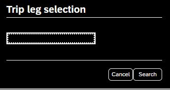
Evening Horizon and Horizon High Contrast Black does solve that issue, but introduces another problem where you cannot see the city when adding a car/hotel, and you cannot see the fine print when booking a hotel.

Horizon High Contrast White seems to have the fewest readability problems in my opinion, though it is also not perfect. My primary complaint on it is that several of the confirmation screens use black text on a dark gray background (image cropped to remove personal identifying information).
It is crazy that such a widely used platform has so many basic accessibility issues.
This content from the SAP Concur Community was machine translated for your convenience. SAP does not provide any guarantee regarding the correctness or completeness of this machine translated text. View original text custom.banner_survey_translated_text
- Mute
- Subscribe
- Bookmark
- Report Inappropriate Content
@ashleyscott Please make sure you report this to your Concur Administrator so that they can open a case in the SAP Concur Support portal. Do you need the contact information for your Concur Administrator?
Thank you,
Lee-Anne Dautovic
SAP Concur Community Moderator
Did this response answer your question? Be sure to select “Accept as Solution” so your fellow community members can be helped by it as well.
This content from the SAP Concur Community was machine translated for your convenience. SAP does not provide any guarantee regarding the correctness or completeness of this machine translated text. View original text custom.banner_survey_translated_text
- Mute
- Subscribe
- Bookmark
- Report Inappropriate Content
Agree with you. The font and shading make it impossible to see the detail.


