- Home
- :
- Product Forums
- :
- Concur Expense Forum
- :
- Re: Next Gen UI - Multi-select checkbox targets si...
This content from the SAP Concur Community was machine translated for your convenience. SAP does not provide any guarantee regarding the correctness or completeness of this machine translated text. View original text custom.banner_survey_translated_text
- Mute
- Subscribe
- Bookmark
- Report Inappropriate Content
Next Gen UI - Multi-select checkbox targets size
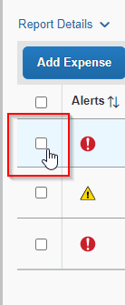
Had a user complaint about the size of the select target for the checkboxes in the list of expenses in the Expense Report. In order to select the checkbox you have to hit exactly within the box. Even a pixel or so outside, will open the item rather than check the box. You can see from the screen grab where the cursor changes.
Clicking outside the box will simply open the expense instead of selecting the box and the user has to cancel to return to the list. It's mainly a problem if the user is on a small screen, clicking boxes in a hurry, using touch instead of a mouse, or using smaller pointing devices like keyboard nubs.
Is it possible to make the target for selecting the box larger, maybe to encompass the cell rather than just the checkbox?
Thank you!
Ken Richards
- Labels:
-
NextGen UI
This content from the SAP Concur Community was machine translated for your convenience. SAP does not provide any guarantee regarding the correctness or completeness of this machine translated text. View original text custom.banner_survey_translated_text
- Mute
- Subscribe
- Bookmark
- Report Inappropriate Content
@kenrichards We have a program for providing product suggestions. You can read about it here: https://community.concur.com/t5/Concur-Expense/Feedback-on-NextGen-Expense-UI/m-p/36795
Thank you,
Kevin
SAP Concur Community Manager
Did this response answer your question? Be sure to select “Accept as Solution” so your fellow community members can be helped by it as well.

This content from the SAP Concur Community was machine translated for your convenience. SAP does not provide any guarantee regarding the correctness or completeness of this machine translated text. View original text custom.banner_survey_translated_text
- Mute
- Subscribe
- Bookmark
- Report Inappropriate Content
Thanks Kevin, I'll take a look. My concern is creating yet another account to access a site to suggest improvements. Probably should either be part of the Community site, or at the very least allow reusing of the ID.
This content from the SAP Concur Community was machine translated for your convenience. SAP does not provide any guarantee regarding the correctness or completeness of this machine translated text. View original text custom.banner_survey_translated_text
- Mute
- Subscribe
- Bookmark
- Report Inappropriate Content
An alternative would be to make the area around the checkbox not an active link, so nothing would happen if the user accidentally clicked just outside the box. I agree this is poor UX design.

